I've got a new attitude about blue. I've decided to add green for two reasons: first I don't like any blue blocks I've done for this quilt so far, and second I bought what I thought was a ton of precut 2 1/2" solid color strips, but it turns out I'm going through them like a mad man, so the single colors are running low. No matter, I like being resourceful. It makes it more fun for me and seems to deepen my creative possibilities, and there's no telling what kind of happy "mistakes" I'll make by combining colors. I'm posting pictures so I can talk through some thoughts I had while choosing and sewing.

Usually the first few pieces are pretty easy for me to choose. I try to find the lightest shade of the block color I can find, and sometimes I choose just straight up white. I like a little bit of the shade of the color in the second, third or fourth piece next to a white piece. In this case, though, I decided not to use a solid white but try to go for prints that contained white or off white, and then throw them next to some light blue and green solids. Early on in the block, it's a crapshoot and I usually feel some fear about making the "wrong" choice, but you know what, it really doesn't matter, because no matter where I am in the block I can always proceed from where I've been. Hmm, sounds very Zen. But the color choices before always influence my choices ahead.

I like to grab different fabrics to see them next to what I've sewn and imagine what they might look like after they're sewn in. The full piece of fabric looks much different from a 2" strip and so I really have to use my imagination and hone in on smaller areas of the fabric that might look good. The one above had a lot of brown in it so I fold and refold and find some spots that have more blue and green and I come up with this:

I think it looks pretty cool so far. And I like how you can only see the tips and edges of those brown parts of the new piece. It also seems to balance the piece opposite it with the brown and dark & light green leaves. Cool contrast.

So at this point I feel like I could be off my rocker because of some of the colors I've chosen. I tried something this time that I haven't usually thought too much about in the past blocks for this quilt. Since I used so many prints with lots of colors in them I started looking at using the solids to complement the little oddball colors in the prints. I noticed that turquoise and shades of aqua emerged. I like this, it's going in a direction that makes me smile.
So I kept going with it. I afraid I might be getting too blue heavy. Above, it kind of makes that lower left corner of green look like yellow. Not what I was going for but I think I'll forgive myself and think instead about the big picture when this bad boy is resting next to his colorful neighbor in the finished quilt top. Phew, disaster and melodrama averted.

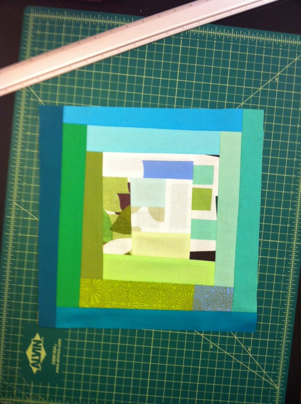
I like to lay the block on top of dozens of randomly colored strips and play around with the one that'll come next. Since this is the last round, I want them to be quite dark so that they frame the piece but still go along with the color theme. This time I toyed mostly with dark blue but realized I was getting blue heavy so threw in a dark green and a really cool Marimekko gradation of dark blue, dark green and light blue. Below, it's the one on the far left. It's hard to see how subtle and beautiful the combination is from the picture, but, up close, it's gorgeous. It was too short so I spliced another piece into it. And this is the finished block:

It's going to show up amazing in the finished top.Tonight I'm making the reverse block, dark center to white border, which is always like taking a relaxing vacation since I've already worked out the color choices in the first block. Alright!
You know, I totally get what you are saying. I often work in a very similar manner. What comes next is determined by what I have already done. I feel a certain amount of anxious tension during the process but, it's that very excitement that keeps me engaged. It's looking fantastic.
ReplyDeleteYour block looks fantastic surrounded by orange! Glad you found me, because now I've found you. Victoria (Bumble Beans) and I were wondering where you San Francisco folks were hiding.
ReplyDeleteLoved reading about your process! It is always fun to see what everyone is doing.. specially their thought process while they pour out their creativity!
ReplyDelete